The Story Behind Our Name and Logo
For us, it’s so much more.
It’s everything.
In the summer of 2021, we embarked on an exciting journey to develop a new name and brand identity that more precisely represented our culture, people and partnership focus. After nearly two decades of growth, it was our time to take a bold step forward to authentically demonstrate the values and principles that have made us the agency we are today. Equally important, our refreshed look and feel needed to reflect our agency vision while reinforcing our commitment to evolving and meeting the changing needs of our partners.
This project presented us the opportunity to use our marketing experience, expertise and unique archetypal branding methodology to create something truly special for us – to create a book cover that more precisely represents our brand story and culture. After 10 months of insightful partner discussions, self-reflection and amazing discovery, we’re excited to share the story behind Truelio, our new brand identity honoring the culture, passion and people of our company.
The Truelio Brand Process
The perfect blend of art, science and great storytelling.
At the heart of every great brand is a unique and extraordinary culture. Truelio’s brand development process builds on the age-old use of archetypes to inspire a brand identity that captures the heart and soul of a company’s culture. Based on Swiss psychologist Carl Jung’s archetypal theory, there are 12 archetypes that are universally known personas that have been used throughout history in storytelling. The archetypes are present in our subconscious and help us as readers and viewers understand stories and emotionally connect with characters. Since the 1950s, many of the world’s most iconic brands have used archetypes as way to humanize their identity and tell their brand story. By aligning to the archetypes that most accurately reflected their culture and values, they were able to become more emotionally connected to consumers and create a truly authentic brand identity. Truelio’s archetypal process takes this methodology to another level. We incorporate a unique blend of qualitative and quantitative research, artistic design, creative storytelling – and the magic of behavior science to inspire a culturally vibrant and genuine brand experience.
Our Archetypal DNA
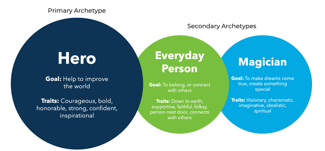
As part of our rebrand discovery, we uncovered every stone and explored every possibility. We interviewed partners and employees as well as had countless discussions on who we are as a company and the values and purpose that drive us. The process was both methodical and emotional as we explored our name options and an enhanced visual and verbal identity. After all was said and done, we arrived upon a set of archetypes that vividly depicted our brand personality and set the foundation for the Truelio brand.
Our Name
You’re likely asking “what’s up with the name?” Throughout the process, several key words and phrases came to surface that would serve as core components of our brand development and identifying our archetypal DNA. Many of these words would also serve as the foundation of our cultural values
However, one word remarkably stood out from the rest – true. As the thread connecting our values, passion and purpose, it would become the hallmark of our new identity. The uniqueness of our people and culture demanded an equally unique name. We adjoined “true” with the suffix “lio” and the rest is history.
Authentic
Real
Trusting
Transparent
Hard-Working
Partner-Driven
United
Compassionate
Empathetic
Loyal
Courageous
Curious
Accountable
true
Adjective
In accordance with fact or reality
lio
m (plural lios)
sheaf; bundle (collection of things bound together)
truelio [true-lio]
noun
A collective group of people authentically bound by one passion and purpose; delivering transformational and results-driven creative and digital experiences.
Our Logo
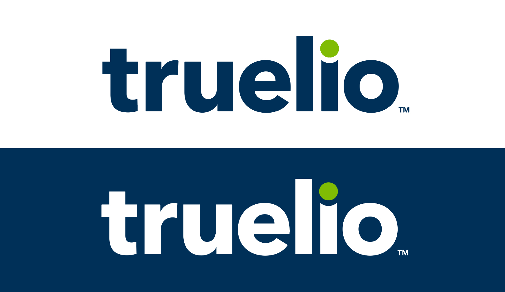
Behind every memorable logo is a fine attention to detail and a connecting story. The Truelio logo was developed to convey our brand persona through a simple and contemporary visual experience that reinforces our brand values.
Typography
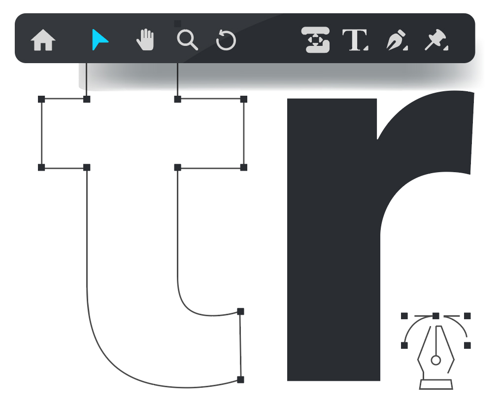
Typography is a significant and often understated component to any logo design. It is not just merely the combinations of colors and shapes, but rather the application of a typeface that authentically connects to your brand voice, tone and cultural values. Like people, fonts carry with them unique personality traits. They impact the viewer’s perception of your brand in a glance and drive an emotional response.
Avenir Next LT Pro Bold was the perfect fit for our logo design. Repeatedly voted by designers as one of the most beautifully designed typefaces, the Avenir font family was legendary type designer Adrian Frutiger’s masterwork and continues to be popular in logo design and brand identities today. In addition to its remarkable flexibility and readability, our lowercase application of the font is not only bold and confident but also clean, simple and approachable, supporting Truelio’s corporate values and our Hero and Every Person brand archetypes.
Color Palette
Similar to typography, our brand color palette is critical to evoking emotion and expressing our brand personality. We carefully selected the color scheme to demonstrate our unique passion, energy and inspirational thought-leadership we strive to deliver.
Our “True Blue” (Pantone 540) was chosen as it emotionally conveys comfort, faith, understanding, clarity, trust and dependability. It’s also a color predominately featured in the color gamma of both the Hero and Every Person archetypes.
It was important we included a complementary color that demonstrated effervescence, passion and enthusiasm. Our “Passion Green” (Pantone 376) was the ideal fit as it conveys calm, harmony, peace and optimism while also demonstrating our energetic spirit.
The Hidden Smile
Approachability and a down-to-earth humility are an important part of our culture. It was important our logo demonstrate these traits in a fun and creative manner. Using negative space and a curvature effect, we formed a smile between the “i” and the dot above it (also known as a tittle). The letter in its entirety also takes the shape of a person, reinforcing our relationship-driven culture and Every Person brand archetype.
Circle Symbolism
Circles are a predominant shape in the Truelio brand identity. As a universal symbol of community, friendship, relationships, perfection, timelessness and unity, the shape embodies many of our cultural values and beliefs. Circles are consistent, steady and sturdy without any breaks or turns. They are also softer and more welcoming than harshly-angled shapes like triangles and squares. Rings are connected with reliability, partnership and a lot of other fun things in life, further supporting our brand story and Every Person brand archetype.
